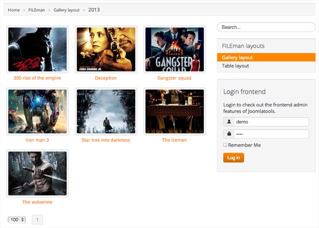
FILEman 2 is the next release major release we are working on. With FILEman 2 we are dropping support for Joomla 1.5 at the same time the FILEman core is being refactored to make use of Joomlatools Framework 2.0, the next major iteration of our extension framework.
Additionally we also reworked the templates to make it easy for designers to style the gallery and make it blend nicely with their templates. Here is an overview of the changes we are working on.
Progressive enhancement
Progressive enhancement is a method of building a website in which content is ‘stacked’ in different layers. If a layer fails or is not supported, the content is provided by the layer below it.
The FILEman 1.0 gallery did not enhance progressively. It relies heavily on Javascript and doesn’t respond 100% to browser resizing. Skinning and/or overriding the gallery is quite complicated due to the vast amount of javascript we used to make it all work.
For the new 2.0 gallery we wanted to ensure the it would enhance progressively, to do this we used the following design principles :
- Start with correct semantic html markup first
- Rely on pure CSS as much as possible for a fully working responsive gallery
- Make sure the gallery works (as good as possible) on older browsers
- Add javascript to enhance the gallery for browsers that support this
- Make sure the gallery is as flexible as possible to make skinning easy
The chocolate coating
The biggest challenge taking all the javascript out and replacing was to find a css-way to vertically align an unknown amount of items and make this work on various screen sizes and devices. We tried several techniques and ended up by using the following code:
ul li {
 display: inline-block;
 vertical-middle;
 text-align: center;
}
Here we are using the very versatile display: inline-block; rule. It combines the best of two worlds. By using it, you can still easily add margins, paddings widths and heights but the elements also act like they are text. Allowing them to listen to vertical alignments and react on font-size changes.
The hard candy shell
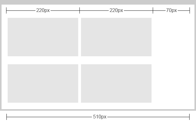
With a the CSS layer done it was time to add some Javascript to enhance the user experience. One of the things we added was a dynamic column width for the items. All items have a maximum of 220 pixels in width. So this means there’s place for 2 items in a 510 pixel wide gallery component. But it also means we are left with 70 empty pixels on the right.
Here’s an example image of that.
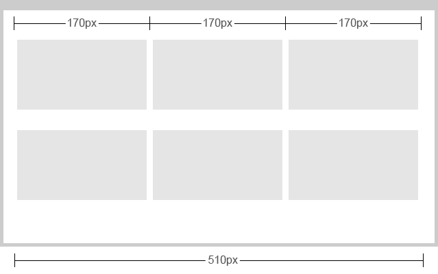
To fix this we always check the amount of images that naturally fit in the component area and we add one and make this the amount of columns. In the above image 2 items fit naturally so we use a 3 column layout. To see how that looks check the following image.
We ended up with a gallery that works perfectly on the majority of browsers using pure CSS. The Javascript we’ve added is purely to enhance the whole gallery experience. Even with Javascript disabled the gallery looks really good.
Built to be modified
All this was a mammoth task but we managed to create a gallery that can be modified without the need to have much knowledge about Javascript. Remember to never hack the core of Joomla and therefore always use template overrides to manipulate the output of extensions. Here you can find a tutorial on how to create template overrides.
When can I expect this ?
You can expect these changes in the final release of FILEman 2 which is in testing phase at the moment.


